Revamped Finlatics
When I took the lead on the Finlatics revamp, the platform faced a critical challenge: despite housing valuable financial content, user engagement was dropping.
We identified several core issues: a confusing navigation system that hid key programs, an outdated design that eroded user trust, and a lack of data visibility for our internal team to make informed decisions
When I took the lead on the Finlatics revamp, the platform faced a critical challenge: despite housing valuable financial content, user engagement was dropping. We identified several core issues: a confusing navigation system that hid key programs, an outdated design that eroded user trust, and a lack of data visibility for our internal team to make informed decisions
Scope: Revamp Finlatics
Duration: 1 Year
Role: UI/UX Designer
Team:1 PM, 2 Developers, 3 Stakeholders
Tools: Figma, Miro
Scope: Revamp Finlatics
Duration: 1 Year
Role:UI/UX Designer
Tools: Figma, Miro
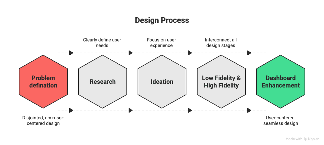
Design Process
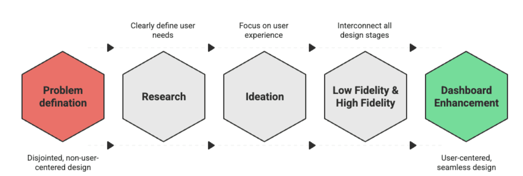
Brief-
I redesigned the learning portal of Finlatics to improve user progress visibility, reduce drop-offs, and increase engagement for financially novice learners.
Brief
Brief
Challenge & Impact
Problem
Confusing navigation with unclear pathways to programs and resources.
Outdated Portfolio redesigned with clear information architecture for better navigation and readability.
Program course names not well structured, making it hard for users to compare and choose.
About Us page overloaded with information, leading to low readability.
No dashboard for data visualization, making it difficult for the team to see active users, enrollment stats, and detailed user information.
Confusing navigation with unclear pathways to programs and resources.
Outdated homepage theme that didn’t reflect a modern learning platform.
Program course names not well structured, making it hard for users to compare and choose.
About Us page overloaded with information, leading to low readability.
No dashboard for data visualization, making it difficult for the team to see active users, enrollment stats, and detailed user information.
Problem
Problem
Goal
Make stock market learning clear, interactive, and motivating.
Streamline navigation so programs are discoverable in 3 clicks or less.
Increase enrollment (+30%) and retention (+15%) through progress tracking.
Deliver a responsive, accessible experience across devices.
Goal
Make stock market learning clear, interactive, and motivating.
Streamline navigation so programs are discoverable in 3 clicks or less.
Increase enrollment (+30%) and retention (+15%) through progress tracking.
Deliver a responsive, accessible experience across devices.
Research
Research
Research
Competitive Analysis – We analyzed platforms like Coursera and Udemy and found their modular lesson structure and clear progress bars were highly effective at keeping users motivated. We decided to adopt a similar approach.
User Feedback Review – Collected comments from current users highlighting confusion in finding programs and difficulty understanding long-form content.
User Insights – Collected comments from current users highlighting confusion in finding programs and difficulty understanding long-form content.
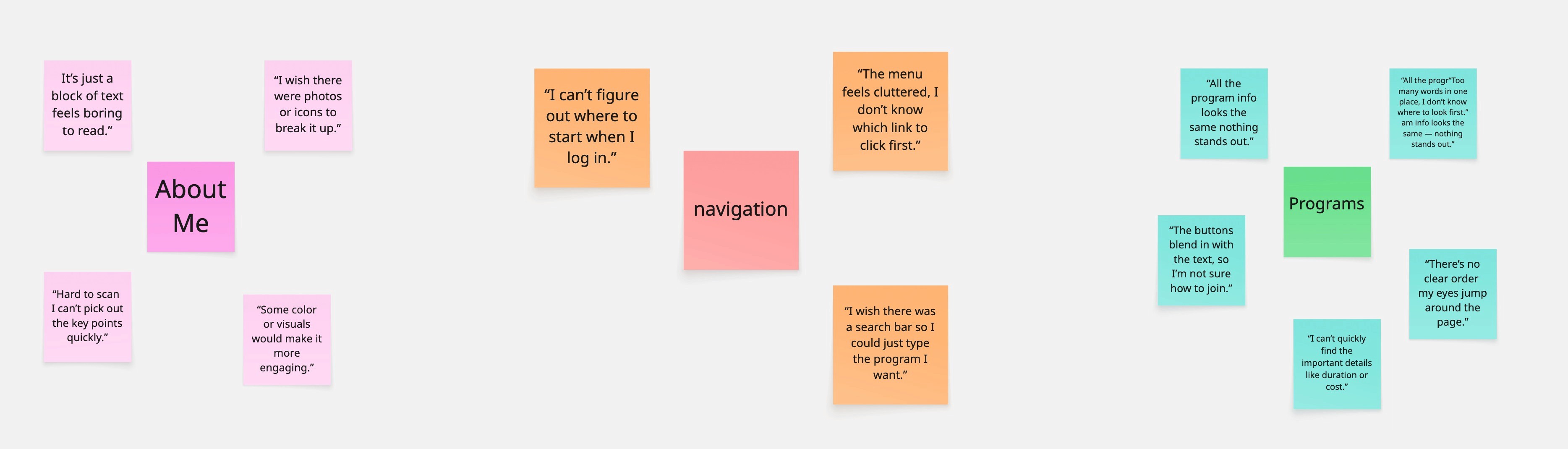
Student: “I can’t figure out where to find the programs I’m interested in.”
Program Seeker: “The course names are confusing; I don’t know which one fits me best.”
New Visitor: “The About Us page has too much information; it’s overwhelming.”
Admin: “There’s no dashboard, so I don’t know how many users are active.”
User Feedback Review – Collected comments from current users highlighting confusion in finding programs and difficulty understanding long-form content.
Competitive Analysis – We analyzed platforms like Coursera and Udemy and found their modular lesson structure and clear progress bars were highly effective at keeping users motivated. We decided to adopt a similar approach.
Competitive Analysis – We analyzed platforms like Coursera and Udemy and found their modular lesson structure and clear progress bars were highly effective at keeping users motivated. We decided to adopt a similar approach.
Ideation
Ideation
We used affinity mapping to group user feedback into themes like navigation, content layout, and program discoverability. The “How Might We?” exercise helped turn pain points into design opportunities, focusing on a more guided and engaging experience. We then sketched concepts and built low-fidelity wireframes in Figma to shape the redesigned landing page, program pages, and dashboard.
We used affinity mapping to group user feedback into themes like navigation, content layout, and program discoverability. The “How Might We?” exercise helped turn pain points into design opportunities, focusing on a more guided and engaging experience. We then sketched concepts and built low-fidelity wireframes in Figma to shape the redesigned landing page, program pages, and dashboard.
Student: “I can’t figure out where to find the programs I’m interested in.”
Program Seeker: “The course names are confusing; I don’t know which one fits me best.”
New Visitor: “The About Us page has too much information; it’s overwhelming.”
Admin: “There’s no dashboard, so I don’t know how many users are active.”
User Insights – Collected comments from current users highlighting confusion in finding programs and difficulty understanding long-form content.
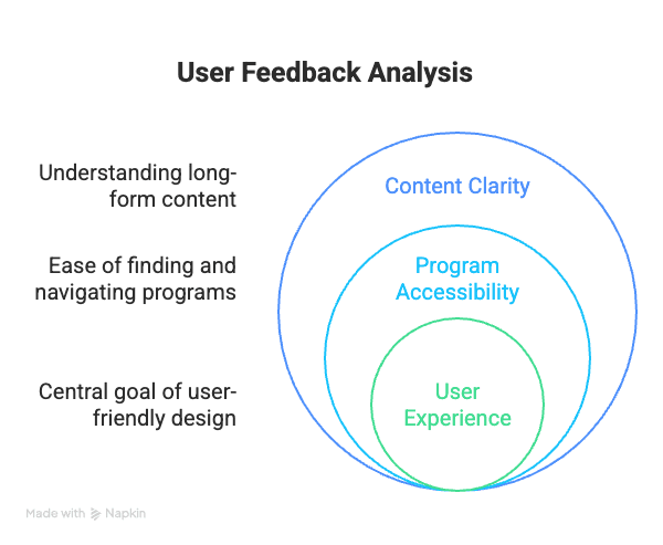
User Feedback Review – Collected comments from current users highlighting confusion in finding programs and difficulty understanding long-form content.
Ideation
We used affinity mapping to group user feedback into themes like navigation, content layout, and program discoverability. The “How Might We?” exercise helped turn pain points into design opportunities, focusing on a more guided and engaging experience. We then sketched concepts and built low-fidelity wireframes in Figma to shape the redesigned landing page, program pages, and dashboard.
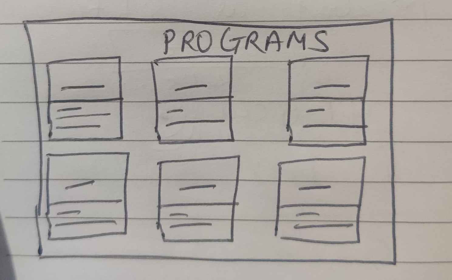
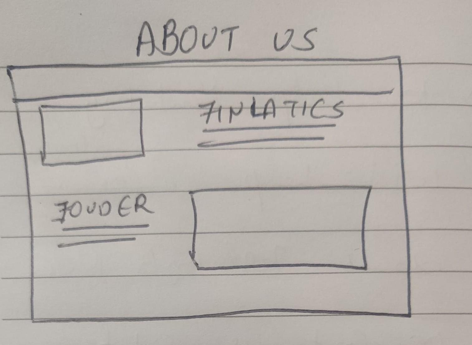
Low-Fidelity Wireframe
Mid-Fidelity Wireframe
Low-Fidelity Wireframe
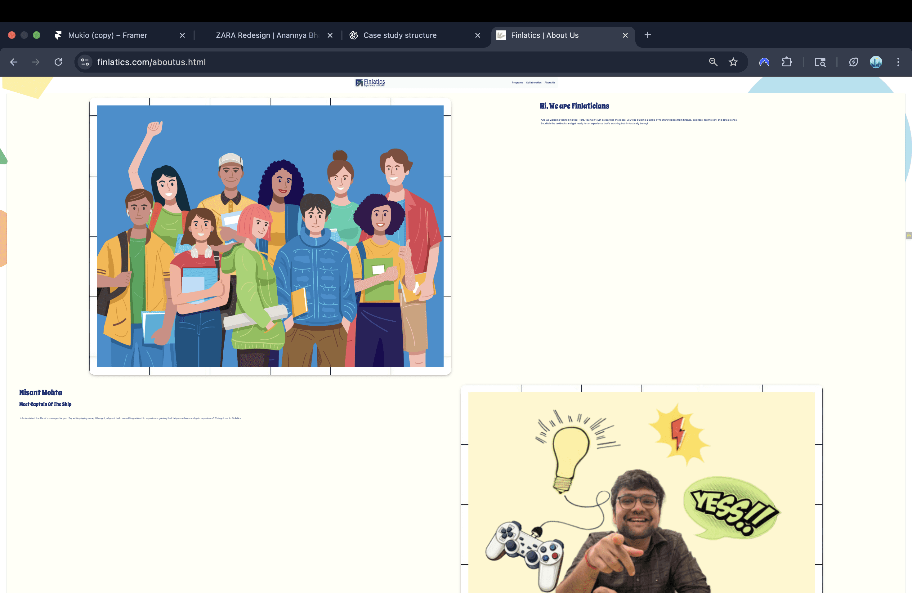
Final UI
Final UI
Mid-Fidelity Wireframe
2.Specialized Program Structure
1.About US
Design Evolution: From Low to High Fidelity
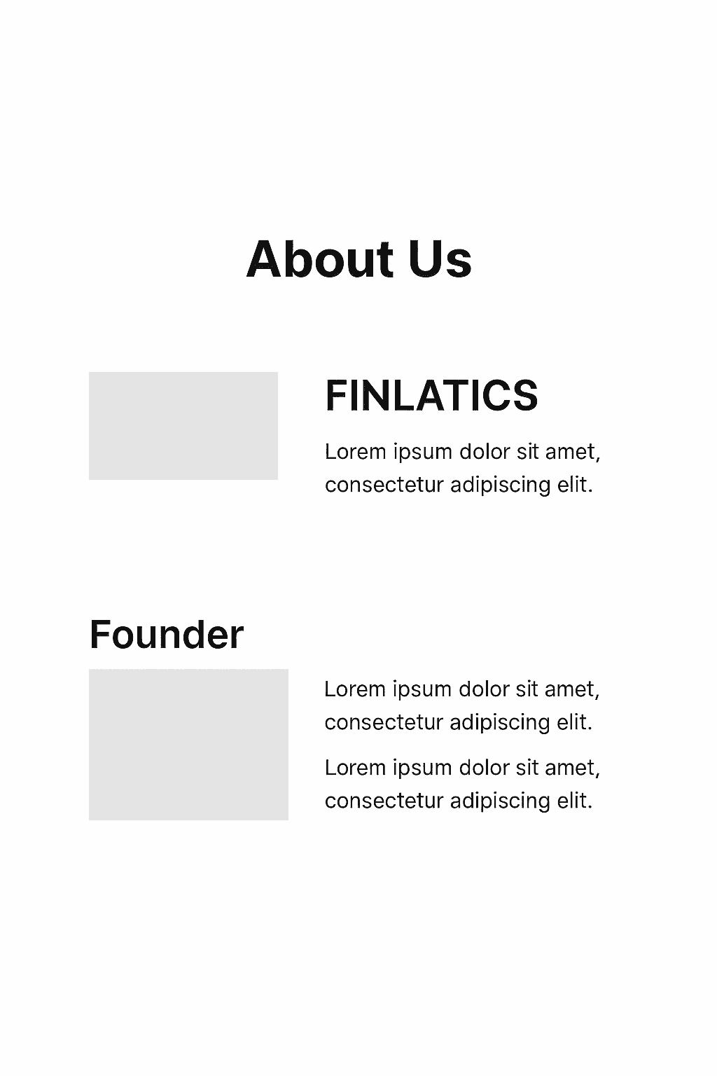
As one user put it, "I wanted to learn about the company, but it was just too much to read. I gave up."
Based on this direct feedback, I immediately iterated on the design. I completely restructured the page to improve its visual appeal and readability.
Usability Testing & Iteration: From Insight to Impact
Usability Testing & Iteration: From Insight to Impact
Mid-Fidelity Wireframe
Mid-Fidelity Wireframe
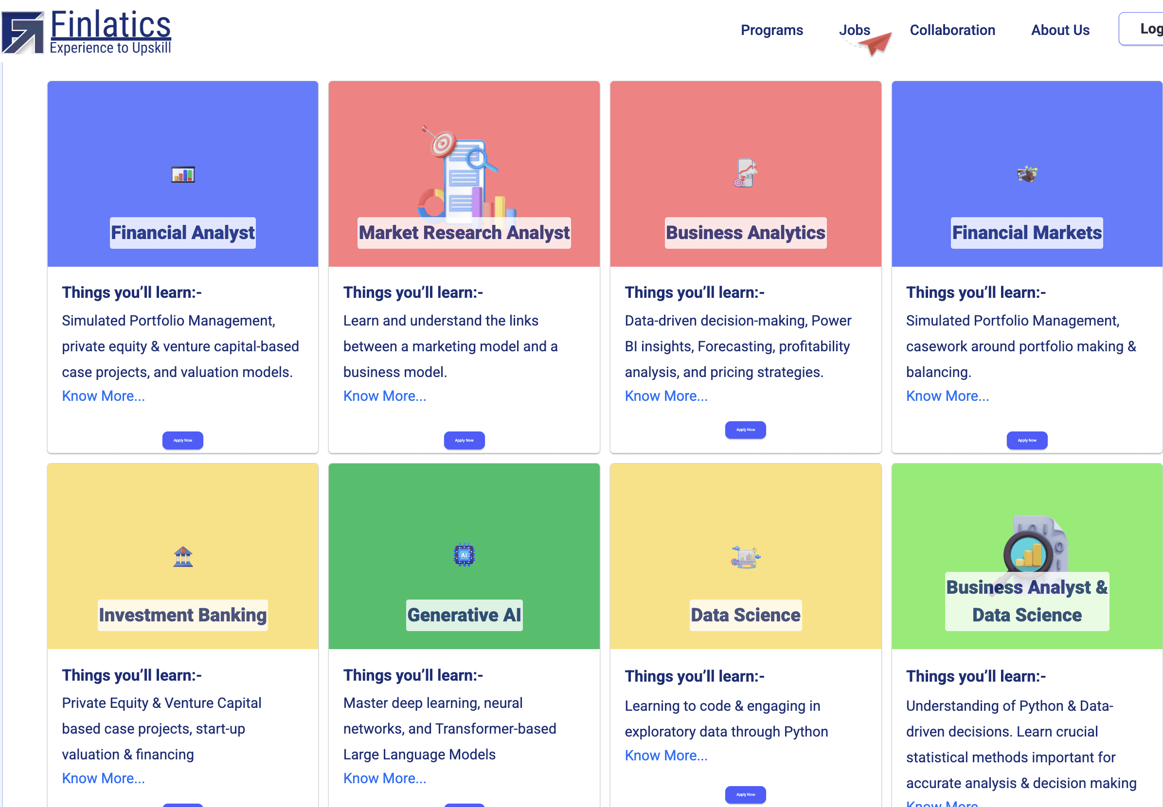
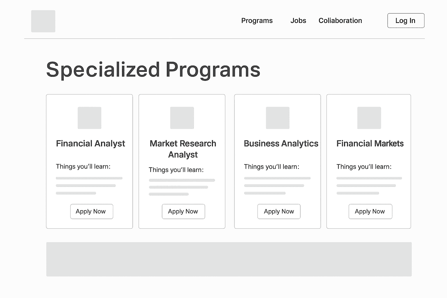
As one user noted, "I can see the program titles, but I'm not sure what they actually cover or how to learn more."
Based on this direct feedback, I immediately iterated on the design. I redesigned the program cards to improve content clarity, adding key details like "Key Topics Covered" and "For Beginners." I also made the "View Program" button a much more prominent and clear call-to-action.
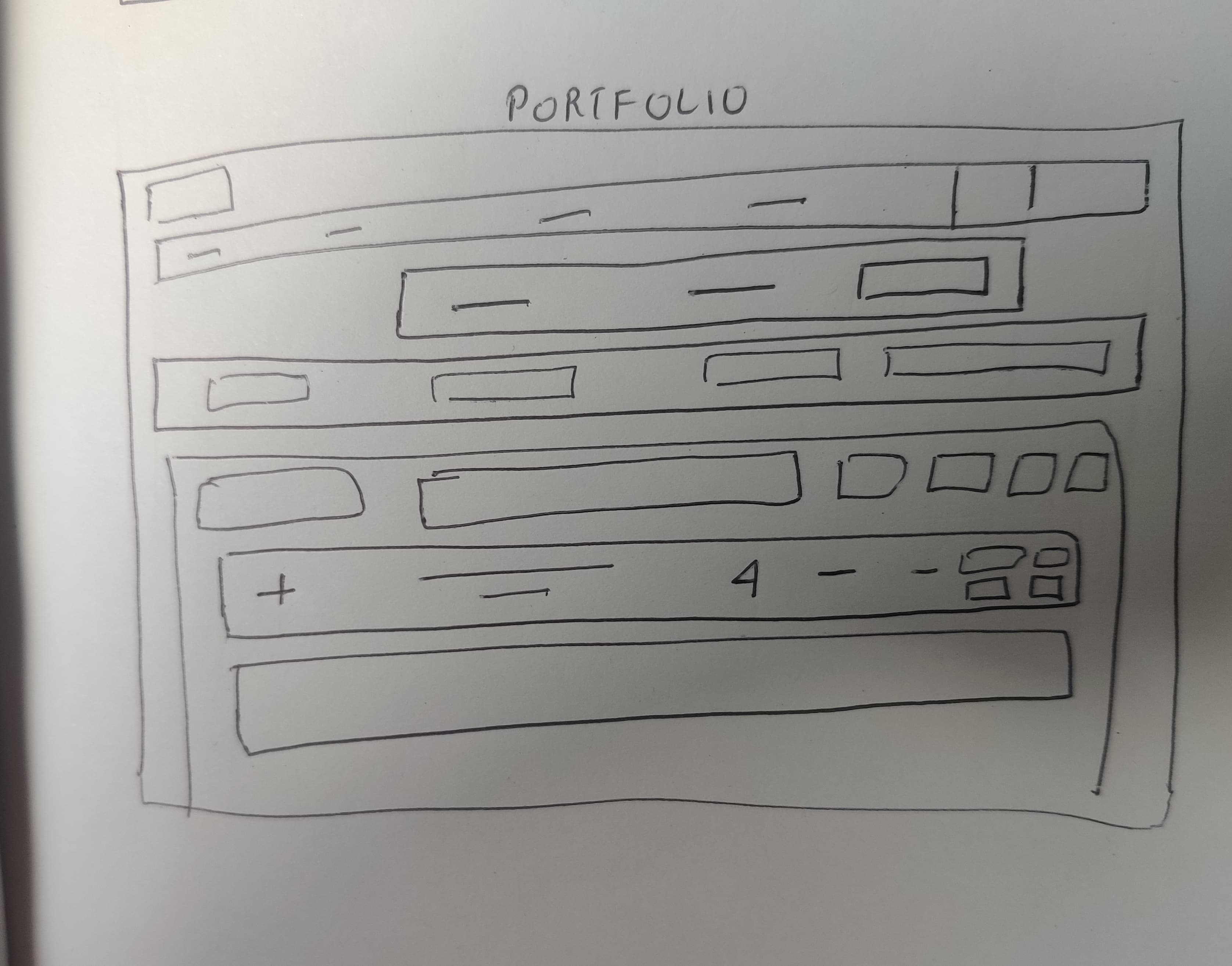
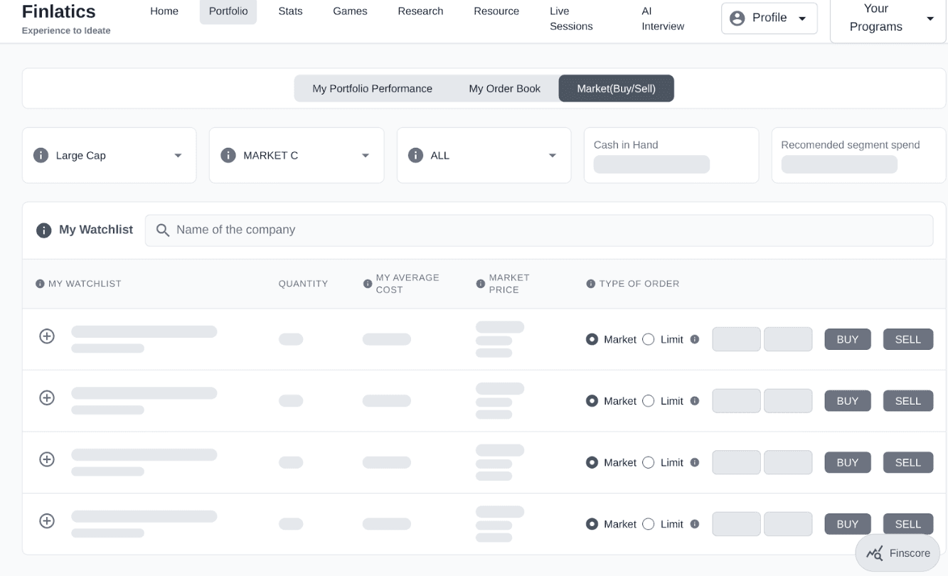
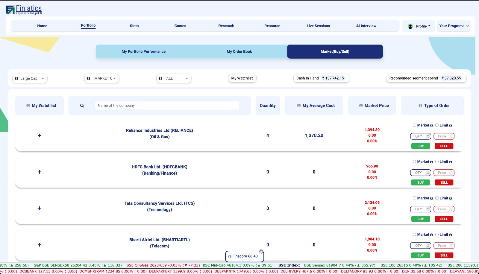
3.From Outdated to Modern: Portfolio Redesign
Usability Testing & Iteration: From Insight to Impact
As one user noted, “It was hard to get an overview of the company and know where to buy or sell.”
Based on this feedback, I redesigned the page with a simplified visual hierarchy. The buy/sell actions are now immediately visible, excessive content was reduced, and the information architecture was clarified for a smoother, more intuitive experience.
Low-Fidelity Wireframe
Mid-Fidelity Wireframe
Final UI
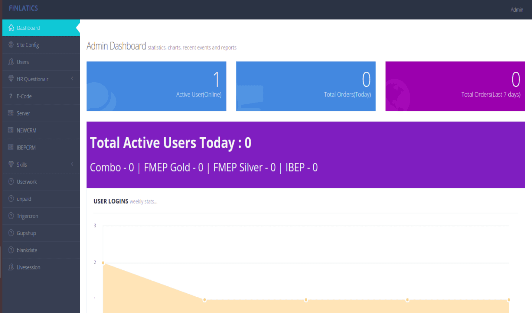
Admin Dashboard Enhancements
Because of time constraints, we reduced the scope of dashboard features. For example, we initially planned to include advanced user data insights, but implementing them would have required a complete SQL database overhaul, which was out of scope for this phase. Instead, we focused on core usability improvements streamlining navigation, clarifying program listings, and delivering a functional dashboard for real-time tracking.
Impact & Results
We designed an admin panel that gives the team real-time insights into platform performance, including total active users, active program counts, and enrollment statistics. This improves internal efficiency by enabling quick decision-making and better program management.
Ideation
Ideation
We used affinity mapping to group user feedback into themes like navigation, content layout, and program discoverability. The “How Might We?” exercise helped turn pain points into design opportunities, focusing on a more guided and engaging experience. We then sketched concepts and built low-fidelity wireframes in Figma to shape the redesigned landing page, program pages, and dashboard.
Low-Fidelity Wireframe
Low-Fidelity Wireframe
Mid-Fidelity Wireframe
Mid-Fidelity Wireframe
Mid-Fidelity Wireframe
Mid-Fidelity Wireframe
Low-Fidelity Wireframe
Final UI
Final UI
Mid-Fidelity Wireframe
2.Specialized Program Structure
1.About US
2.Specialized Program Structure
Design Evolution: From Low to High Fidelity
Design Evolution: From Low to High Fidelity

User- "I wanted to learn about the company, but it was just too much to read. I gave up."
Based on this direct feedback, I immediately iterated on the design. I completely restructured the page to improve its visual appeal and readability.
User-"I can see the program titles, but I'm not sure what they actually cover or how to learn more."
Based on this direct feedback, I immediately iterated on the design. I redesigned the program cards to improve content clarity, adding key details like "Key Topics Covered" and "For Beginners." I also made the "View Program" button a much more prominent and clear call-to-action.
3.From Outdated to Modern Portfolio Page
3.From Outdated to Modern Program Structure
Low-Fidelity Wireframe
Low-Fidelity Wireframe
Mid-Fidelity Wireframe
Final UI
User-“It was hard to get an overview of the company and know where to buy or sell.”
Based on this feedback, I redesigned the page with a simplified visual hierarchy. The buy/sell actions are now immediately visible, excessive content was reduced, and the information architecture was clarified for a smoother, more intuitive experience.
Mid-Fidelity Wireframe
Because of time constraints, we reduced the scope of dashboard features. For example, we initially planned to include advanced user data insights, but implementing them would have required a complete SQL database overhaul, which was out of scope for this phase. Instead, we focused on core usability improvements streamlining navigation, clarifying program listings, and delivering a functional dashboard for real-time tracking.
Because of time constraints, we reduced the scope of dashboard features. For example, we initially planned to include advanced user data insights, but implementing them would have required a complete SQL database overhaul, which was out of scope for this phase. Instead, we focused on core usability improvements streamlining navigation, clarifying program listings, and delivering a functional dashboard for real-time tracking.
Admin Dashboard Enhancements
Impact & Results
Impact & Results
The redesigned Finlatics platform enhanced user experience and efficiency with a modern homepage, clearer program listings, and smoother navigation. A new admin dashboard enabled real-time tracking of user activity and faster, data-driven decisions.
The redesigned Finlatics platform enhanced user experience and efficiency with a modern homepage, clearer program listings, and smoother navigation. A new admin dashboard enabled real-time tracking of user activity and faster, data-driven decisions.